Re: Interpreter 2.0?
Posted: Fri Mar 22, 2024 9:48 pm
It looks like those cheap study guides thechurch used to have:
or

or

- Doc
or
or
- Doc
Internet Mormons, Chapel Mormons, Critics, Apologists, and Never-Mo's all welcome!
https://discussmormonism.com/
Doctor Scratch wrote: ↑Fri Mar 22, 2024 9:12 pmAs for the logo.... I am inclined to think it looks a bit like a side-view of a Slinky in motion. You know: when you set the spiral-shaped toy in motion, it sort of flops over and briefly forms a rainbow-like shape that's not unlike the new logo. Actually, "Slinky in motion" rather sounds like a good descriptor for Mopologetics, if I do say so myself....

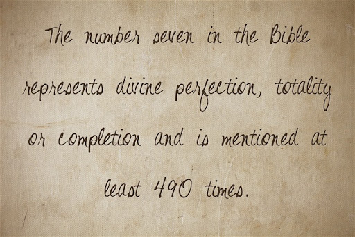
Seven is a divine number, I believe, so it can be a nod to that, too.Doctor Steuss wrote: ↑Fri Mar 22, 2024 9:44 pmI feel moved upon to interpret The Interpreter.
The rays are those of the crown of Liberty, representing the highest calling of the foundation, which is to liberate people from their ignorance. Below, is a door for those who wish to knock, so the fruits of the spirit and reason can be opened unto them. There are seven rays to represent the divine number of completion, and a commitment to work tirelessly until the hopeful and promised day of divinely mandated rest when the Savior will take upon his earthly crown and reward those who have been faithful Mopologetic servants.
Selah.
This feels ancient to me. I declare it a bullseye.Doctor Steuss wrote: ↑Fri Mar 22, 2024 9:44 pmI feel moved upon to interpret The Interpreter.
The rays are those of the crown of Liberty, representing the highest calling of the foundation, which is to liberate people from their ignorance. Below, is a door for those who wish to knock, so the fruits of the spirit and reason can be opened unto them. There are seven rays to represent the divine number of completion, and a commitment to work tirelessly until the hopeful and promised day of divinely mandated rest when the Savior will take upon his earthly crown and reward those who have been faithful Mopologetic servants.
Selah.

gawd, be careful! Peterson is gonna plagiarize this for his explanation!Doctor Steuss wrote: ↑Fri Mar 22, 2024 9:44 pmI feel moved upon to interpret The Interpreter.
The rays are those of the crown of Liberty, representing the highest calling of the foundation, which is to liberate people from their ignorance. Below, is a door for those who wish to knock, so the fruits of the spirit and reason can be opened unto them. There are seven rays to represent the divine number of completion, and a commitment to work tirelessly until the hopeful and promised day of divinely mandated rest when the Savior will take upon his earthly crown and reward those who have been faithful Mopologetic servants.
Selah.
I'll bet it was found on one of the newly discovered "lost" and "hidden" Dead Sea Scrolls, thus establishing the antiquity!drumdude wrote: ↑Fri Mar 22, 2024 9:54 pmThis feels ancient to me. I declare it a bullseye.Doctor Steuss wrote: ↑Fri Mar 22, 2024 9:44 pm
I feel moved upon to interpret The Interpreter.
The rays are those of the crown of Liberty, representing the highest calling of the foundation, which is to liberate people from their ignorance. Below, is a door for those who wish to knock, so the fruits of the spirit and reason can be opened unto them. There are seven rays to represent the divine number of completion, and a commitment to work tirelessly until the hopeful and promised day of divinely mandated rest when the Savior will take upon his earthly crown and reward those who have been faithful Mopologetic servants.
Selah.
INTERPRETER SMOKES WEED
I am inclined to think it looks a bit like a side-view of a Slinky in motion. You know: when you set the spiral-shaped toy in motion, it sort of flops over and briefly forms a rainbow-like shape that's not unlike the new logo. Actually, "Slinky in motion" rather sounds like a good descriptor for Mopologetics, if I do say so myself....
I feel moved upon to interpret The Interpreter.
The rays are those of the crown of Liberty, representing the highest calling of the foundation, which is to liberate people from their ignorance. Below, is a door for those who wish to knock, so the fruits of the spirit and reason can be opened unto them. There are seven rays to represent the divine number of completion, and a commitment to work tirelessly until the hopeful and promised day of divinely mandated rest when the Savior will take upon his earthly crown and reward those who have been faithful Mopologetic servants.
Selah.
Now this is the type of constructive feedback that the Foundation needs. I cannot help but note the insipid feedback given thus far on the Interpreter website:It looks like those cheap study guides the church used to have[.]
Excellent and fresh new logo, well done!!!!
I really like it. The Foundation is way overdue for this update. Well done.
I like it.
The new look is fresh and vibrant!
Personally, I think the Foundation should have gone with a logo featuring the following scripture-based illustration of an ancient Interpreter:Love it!
