Themis wrote:Lets just stick with the claimed pause for now. When it comes to graphs we don't draw a line from a high point to try and show a pause. I remember someone for fun did this with the temperature record throughout the 1900's showing all these pauses yet the average temperature was going up the whole time. Look at the years 2002 to 2007. All are well above the years before 1998. That's not a pause in rising temperatures. You should be able to see the overall trend line going up throughout this graph.
People are not photoshopping graphs to conceal warming. Okay? With the exception of some outliers, that crap isn't happening. And such outliers are on both sides. There have been numerous controversies related to climate scientists being caught literally making data up. Notice in this discussion I have not brought that up a single time? I generally try to assume people are acting in good faith.
I'm not drawing a line from 98. Neither are guys like Lindzen. Nobody is trying to play such games to fool people. That's quite an accusation.
I'm excluding 98. Ignore that outlier bump, from 99 onward it's basically flat. A dip/rise/dip around 2010, which averaged out is flat, starts to rise again 15/16, and now it's coming back down again. Does it continue to go down? No way to know, we'll see. I don't disagree with the point you're making at all. But, being fair, that argument flows in both directions. Why are we starting in 1979? Or 1890 or wherever?
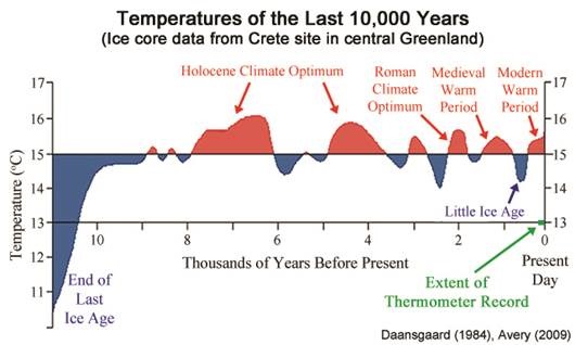
The time scale for this stuff goes a lot further back... millions of years. This chart questions the notion that CO2 drives the climate. CO2 concentrations are going up up up. The rate of increase has been increasing. And yet, from 99 to 16, the atmosphere temp is effectively flat. Some ups, some downs. According to the models this shouldn't be happening, it should just be going up, no dips, just up.
Themis wrote:Moreover, nothing about this suggests anything going on that is outside normal variability.
What we see is temperatures rising over the whole time period in this graph.
No. They go up, they go down, they go up, they go down. A trendline laid over the thing from 79 to today, yes, it goes up. So what? How is this at odds with natural variability and the known history of the earth?


Themis wrote:That's a good amount and if it continues over time then it adds up to quite a bit.
On what basis is it a "good amount" and on what basis will it "continue over time" and what does that even mean? Here's the bottom line. There has been no empirical evidence of any negative warming effects whatsoever. None. Zilch. There isn't anything to point to. The polar bears are fine. Species that are under threat due to human activity, which I don't dispute, has nothing to do with warming and has to do with overt actions, pollution, etc.
At this very moment, polar ice is reported to be higher than ever, over the past 10,000 years.
 https://www.sciencedirect.com/science/a ... 8018302274
Question. From a systems modeling perspective, if you have a region of the planet that is getting colder, while another is getting hotter, what does this mean? Do you understand the difference between a process and a system? Can we make statements about a system, based on the observations of a process? What are the limitations of any statements we might make?
